Create and publish your own React component library with Storybook, TypeScript, and Tailwind
- Published on
- Dale Larroder--5 min read
Overview
- What is a component library?
- Introduction
- Getting Started
- Step 1: Initialize project using tsdx
- Step 2: Adding Tailwind
- Step 3: Setup our build configuration
- Step 4: Publishing to NPM
- Conclusion
What is a component library?
A component library is basically a set of re-usable components. It could be a folder inside your project with common components used throughout the application. It could be a distributed package on npm. It could also be a part of a bigger design system. A component library can be small and it can be large. There are no official rules for what a component library means.
Some examples of a component library are: Google's MUI, Alibaba's Ant Design and IBM's design system Carbon.
Introduction
I have spent the weekend trying out different guides and tutorials, trying to setup Storybook, Rollup, Yarn, and Jest to play nicely together but it was a pain, not to mention I really wanted to make Vite work with this but to no avail.
But behold, I found a package called TSDX, it is a zero-config CLI that helps you develop, test, and publish modern TypeScript packages.
In this guide, I'll be creating my component library playground, this is where (I'm hoping) I can show off some of the cool component ideas I have to the world and
publish it to NPM (because I'm cool).
Getting Started
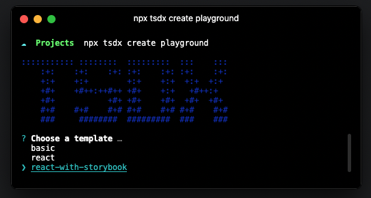
Step 1: Initialize project using tsdx
npx tsdx create playground
This will promp you to choose from 3 different options, basic, react, and react-with-storybook.
Please choose react-with-storybook
Step 2: Adding Tailwind
We will need to install tailwindcss, postcss and autoprefixer
yarn add -D tailwindcss@latest postcss@latest autoprefixer@latest
After installing the tailwindcss dependencies, we need to create a tailwind.config.js file, to do this just run:
npx tailwindcss init
After generating your tailwind.config.js file, you can add the following lines to run
Just in Time Mode and specify a purge path to purge any unused CSS
module.exports = {
  mode: 'jit',
  purge: ['./src/**/*.{js,jsx,ts,tsx}', './stories/*'],
  ...rest of config
}
Next is to create a tailwind.css file at the root of your project, you can name it anything you like by the way,
I just want to name it tailwind.css because thats the only styles I'll be needing.
@tailwind base;
@tailwind components;
@tailwind utilities;
After creating your tailwind.css file, we need to integrate it with storybook, for this step, we will need to add another
dev dependency @storybook/addon-postcss
yarn add -D @storybook/addon-postcss
After installing @storybook/addon-postcss, we need to add it to ./storybook/main.js
module.exports = {
  stories: ['../stories/**/*.stories.@(ts|tsx|js|jsx)'],
  addons: [
    '@storybook/addon-links',
    '@storybook/addon-essentials',
    {
      name: '@storybook/addon-postcss',
      options: {
        postcssLoaderOptions: {
          implementation: require('postcss'),
        },
      },
    },
  ],
  ...rest of config
};
And finally, to be able to see our tailwind styles in storybook, we will need to import our tailwind.css file in .storybook/preview.js
import '../tailwind.css';
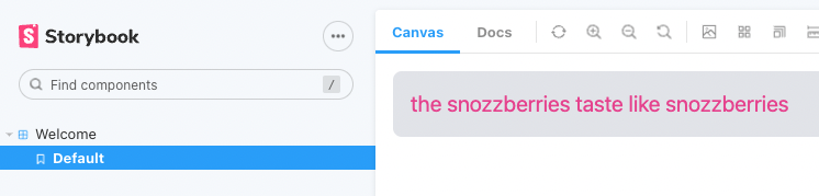
We can now test if your tailwind styles are working, lets run storybook
yarn storybook
You can add the following styles in your src/index.tsx
export const Thing: FC<Props> = ({ children }) => {
  return (
    <div className="text-xl text-pink-500 p-4 bg-gray-200 rounded-lg">
      {children || `the snozzberries taste like snozzberries`}
    </div>
  );
};
and you should see our tailwind styles working
Step 3: Setup our build configuration
Because we added Tailwind to our library, we need to include exporting it's styles in our build config.
Luckily, Tailwind has great documentation, and we can just use it's default configuration from the optimizing for production guide docs
In our package.json file, we just need to add the following
"scripts": {
  ... rest of
"build-tailwind": "npx tailwindcss -o ./dist/styles.css --minify"
}
And we also need to change our build script to consume our new build-tailwind script
"scripts": {
  ... rest of
  "build": "tsdx build && yarn build-tailwind",
}
To check if your build worked, you can run yarn build and check if your build has
generated a styles.css file in your dist folder
dist/
index.d.ts
index.js
... rest of config
+styles.css
The styles.css is important because this is what our package consumers will use for our
styles to take effect in their projects.
Step 4: Publishing to NPM
First step is to push our code to a Github repo, so just create a new repository and push your code to Github,
git init
git remote add origin <repo origin url>
git add .
git commit -m “initial setup
git push origin master
Next step is to login to your NPM account via terminal
npm login
This will prompt you to enter your NPM username, password, and email address.
If you don't have an NPM account yet, you can create an account here
After logging in, we are ready to publish our package, but first, we need to change our
package name to whatever we want, in our case it is called @dlarroder/playground
"name": "@dlarroder/playground",
"author": "Dale Larroder",
"version": "0.0.1",
After changing our package.json file, we can now run our build so it will pick up our new package name.
yarn build
After building, we will have our updated /dist folder with our new name, we can now run our
final command npm publish --access public
npm publish --access public
Boom, you are done! you can now check our NPM account for our new package @dlarroder/playground.
Conclusion
Building and publishing your own package might sound hard at first, but it is really simple when you've tried it, you just need to follow some random guide in the internet like this one, (joke) but CLI tools like tsdx really makes it simple to bootstrap your very own component library. I really had fun creating my playground package and this guide, hope this helps!
Fancy Button!Fun fact! ^This <LinkButton /> component is from my playground!
You can check out more components on playground.dalelarroder.com.